Go to www.hoddereducation.co.uk/wideworldextras for more on mastering this geographical skill
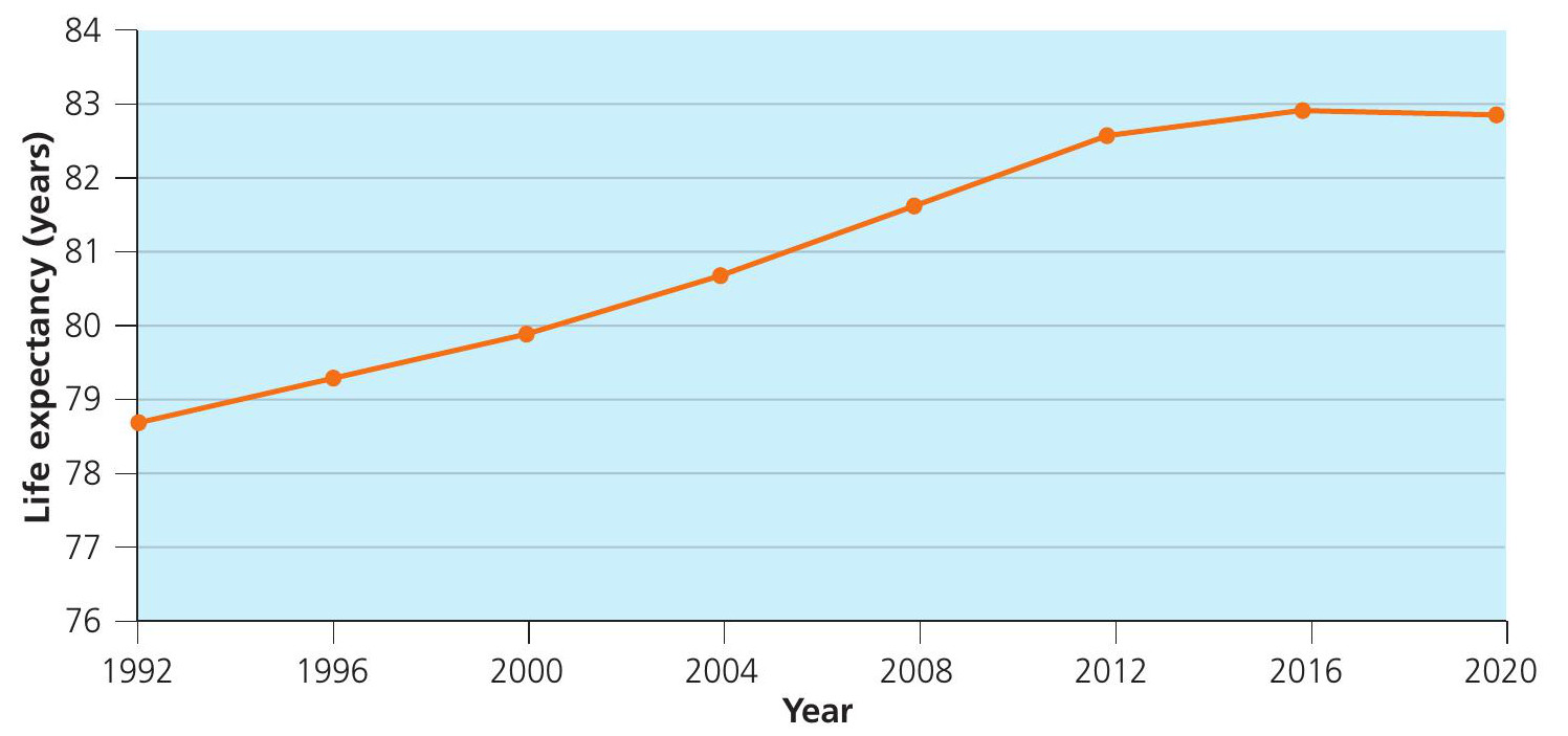
What is the difference between line and bar graphs? You might assume that a line graph or bar chart can be used interchangeably but this is not the case. Line graphs are used for continuous data to show change over time. For example, the life expectancy of a country could be plotted over 30 years. Whereas, bar charts are used to display discrete data. This means that each category has set values within it and is usually a count. For example, how many different types of vehicles were seen during a traffic count? You could also show the life expectancy in 2019 for a range of countries on a bar chart.
Your organisation does not have access to this article.
Sign up today to give your students the edge they need to achieve their best grades with subject expertise
Subscribe