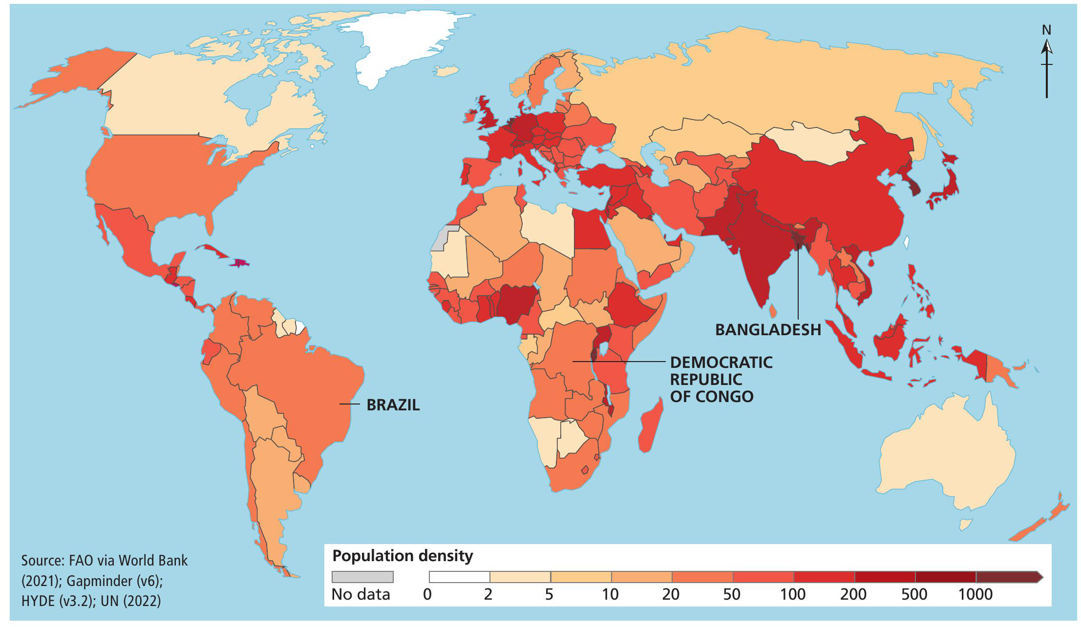
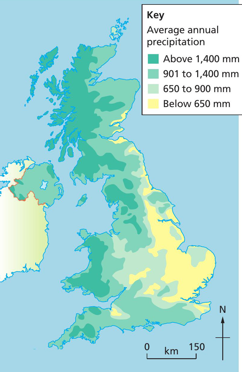
What is a choropleth map? This data presentation technique locates data onto a map using different types of shading or colour. Choropleth maps can be used to show both human and physical geographical data at a range of scales. For example, a choropleth map could be used to show the population density of each country around the world (Figure 1) or on a smaller scale, the average rainfall across the UK (Figure 2).
If you look at the key in Figure 2, you can see that UK rainfall data have been grouped into four categories and each has been given a different shade of the same colour. It is important to notice that darker shades are used for higher values and lighter shades are used for lower values. This is a pattern to follow, if you create your own choropleth map.
Why are choropleth maps used?
Choropleth maps are relatively quick to create and are an effective way of locating data onto the area they come from. This makes it easy to spot patterns and make comparisons between different locations.
However, there are limitations with using this technique. Sometimes, it can be difficult to distinguish between the different shades of colours used. If the data used relate to a large area, as in Figure 1, then variations within the area will not be shown. The map can also give the impression that there are abrupt changes in data at the boundaries of each shaded area, which usually isn’t the case.
How do I read a choropleth map?
The choropleth map in Figure 1 shows the average population density (number of people per square kilometre of land area) of countries around the world. By looking at the key at the bottom of the map, you can see that the darkest red is the highest value, with over 1,000 people per square kilometre (on average). Bangladesh is only country with this density of population.
The lightest shade on the map indicates a population density of between 0 and 2 people people per square kilometre (on average) and Greenland is the only region with this population density. Both the Democratic Republic of Congo (DRC) and Brazil are shaded the same colour, showing they have between 20 and 50 people per square kilometre. However, Brazil’s average is 25.76 people per square kilometre, compared to the DRC’s 43.67 people per square kilometre, which is a significant difference not suggested by the map which shows them as the same colour.
What is a choropleth map? This data presentation technique locates data onto a map using different types of shading or colour. Choropleth maps can be used to show both human and physical geographical data at a range of scales. For example, a choropleth map could be used to show the population density of each country around the world (Figure 1) or on a smaller scale, the average rainfall across the UK (Figure 2).
If you look at the key in Figure 2, you can see that UK rainfall data have been grouped into four categories and each has been given a different shade of the same colour. It is important to notice that darker shades are used for higher values and lighter shades are used for lower values. This is a pattern to follow, if you create your own choropleth map.
Your organisation does not have access to this article.
Sign up today to give your students the edge they need to achieve their best grades with subject expertise
Subscribe