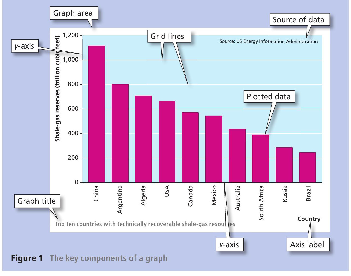
It is important to present geographical data in a way that makes it easy for someone else to use, interpret and draw conclusions from the figures. Presenting data in the form of graphs or maps can help to illustrate patterns and processes, especially spatial concepts and the relationship between factors or variables. But data presented in an inappropriate way are difficult to interpret.See if you can spot examples of this in graphs and charts published in the media and on websites.
This is the first of two Geographical Skills columns looking at how to use graphs to present data. This first column concentrates on the range of ‘core’ graph types — the most common types of graph and those which can get misused in geography and in fieldwork.
Your organisation does not have access to this article.
Sign up today to give your students the edge they need to achieve their best grades with subject expertise
Subscribe