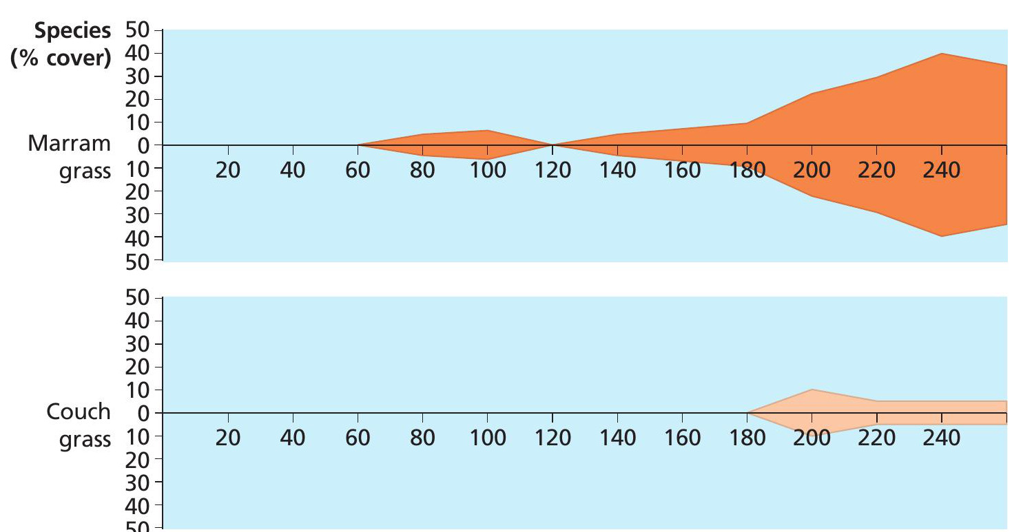
Figure 1 An example of a simple two-species kite diagram Distance (metres)
In the last issue of GEOGRAPHY REVIEW Geographical Skills looked at how to draw and interpret graphs, with an emphasis on presenting data in a way that is accurate and easy to follow. It is a good idea to refer back to the September issue before reading this Geographical Skills, which describes more specialised maps, charts and graphs and when to use them.
Here is a quick reminder of the key reasons for plotting and visualising geographical data.
Your organisation does not have access to this article.
Sign up today to give your students the edge they need to achieve their best grades with subject expertise
Subscribe