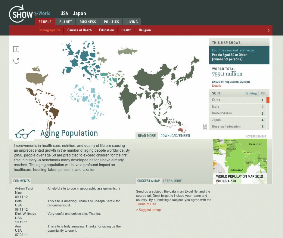
L og on to the Population Reference Bureau website using the shortcut http://tinyurl.com/cz99u7a. You will see a global map showing variations in total population among the world’s nations. Roll over each continent with your cursor to see a summary table of data for each continental sub-region.
The data shown are from 2012 but if you click the option above the map for the 2050 estimate you can see where the most significant changes will occur. The countries likely to experience fastest growth can be identified more clearly by selecting the <Natural Increase> option. Here it can be seen that many countries in central and eastern Europe are likely to experience a population decrease, although the UK’s population is expected to increase. By double-clicking on an individual country (such as the UK) you are able to see figures for that country and its immediate neighbours.
Your organisation does not have access to this article.
Sign up today to give your students the edge they need to achieve their best grades with subject expertise
Subscribe